A great power to use when looking to engage users in an app or product is giving them creative freedom. When people are allowed to be creative, they engage more with a product and once that creativity gets social it all becomes fun, not to mention highly addictive. Moreover, when people are not limited to predefined paths or actions in an app’s usage, giving them additional options or even absolute freedom can spike interest for an app.
A creative being
People are by nature creative beings. Creativity gives subconsciously a feeling of satisfaction and grabs the attention of the participant. When people are given the option to become creative, they can provide solutions to problems and make tasks fun. This feeling of satisfaction engages a user in the process.
“Creativity is a drug I cannot live without” – Cecil B. DeMille
I had an opportunity to see for myself how that creativity feeling could be used to grab the attention of people and engage them into a specific cause: while working on an interactive installation project, my team had to create something that would motivate people to recycle batteries. Based on that concept, we decided to create a magic flute where people could generate music simply by throwing their batteries down the flute holes. When this installation was placed in the biggest mall in town, it was really astonishing to see that not only children but adults too, got in line for a chance to compose their own music piece while recycling! Recycling was not boring any more, but a fun and interactive game.
Lego is a great example of how leveraging creativity can be fun and addictive. With Legos, people can connect and assemble pieces in many different ways to create different structures, buildings, vehicles or whatever triggers their imagination. Building upon this concept has created the Lego empire, making it one of the most popular brands out there. Legos transcend age and time and will probably continue to do so for a long time.

If you are wondering if people can get creative, it wasn’t that long ago that Facebook brought out emoticons in the “Like” button. A lot of people used those as a voting mechanism soon after. Remember seeing anything like this around?

Creativity for fun – The social aspect
So, does this apply in apps too? Leveraging people’s creativity within an app can really engage people and make their usage fun and challenging. All this, when it involves multiple users as well as social media can really make an app stand out from the crowd.
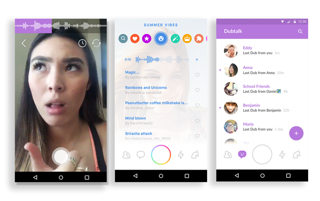
A really good example of this concept is the Dubmash app. The Dubmash app, allows users to create their own videos and lip sync different songs, making the process really creative and fun, especially when sharing the result with friends and other players.

How about pantomime? We are all familiar with the age-old game of pantomime. As mentioned before, when creativity is combined with social mechanisms, the fun can really start. And fun brings in masses of users, also making them loyal players. This explains the wide reach of apps like Charades. In this app, users are provided with specific words on different topics and they win by being most expressive and creative when describing these words to their teammates.

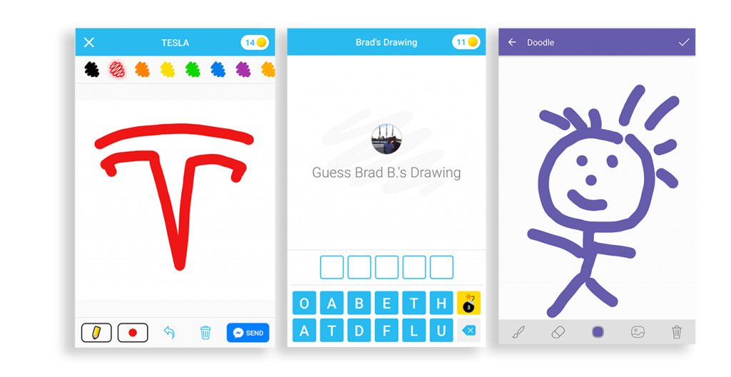
The famous Pictionary follows the same concept. It is a game where users get creative and draw specific words to the other players, who they try to guess what the word is. We have all been there. It’s fun, competitive and addictive. The Draw something app has taken advantage of that concept. In that app users have to guess what others are drawing in an addictive and creative endless social loop.
The same concept was applied in the Viber messenger app. During message composition in a chat, users are allowed to send over a doodle, making communication a lot more fun.

Creativity that creates addiction
Leveraging creativity to create addicted users in a product is not that uncommon in the apps world. A great example is Tinder. In the Tinder app (or any other dating app) users are given the option to like or dislike a person and if both like each other, then they can start chatting. The absolute goal is to meet that person in real life. Initiating that chat though, is really challenging. It requires a lot of creative thinking in order to grab the attention of the person on the other side. Pretty much like real life. A user’s profile may get dozen of matches daily, but turning even one of them into an actual live date depends on their creativity. And that challenge is highly addictive!

But what about those that cannot take that extra step or are simply not that creative? Well, there are numerous apps that capitalize on this and share “creative lines” to get the process started (yes, there is a business opportunity everywhere). A simple app store search will show you how many such apps there are.
Freedom as a power
Nobody likes being told what to do. Most people do not even like to follow a path that has been predefined for them. Giving users the feel (even if that is not actually true) that they have the power to do things their own way in order to take advantage of the value of an app, can make them engage even further.
Giving the freedom to users to leverage their creativity is a really common approach. It has been used in games for years. Instead of giving users specific steps to follow, game designers let them be creative and have multiple options of proceeding through the game. Let’s have a look at SimCity, for example. Not everyone can level up in the same way. The player acting as Mayor is given a blank map to start with, and must expand the city with the budget provided. What a great opportunity to show how creative you can be! Other games, (i.e. the Age of Empires), are also great examples of this approach. Users define their own strategy and creativity in the game and they can achieve the win in a number of different ways. This approach makes users addicted and they end up playing for hours, since their progress is relevant to how creative their strategy can be.

Giving freedom of usage to users will always bring about new ways to achieve goals in ways that keep them engaged. Personalization is a part of this freedom that can be given to a user. It’s similar to the free-to-define strategy in the Age of Empires game mentioned above or the free-to-construct anything Lego concept. It lets you create what you want and customize it however you wish in order to use in an app. You can see that in social platforms like Facebook, Twitter, Medium, Instagram etc. People visit them daily, checking their timeline or wall. Have you ever thought what your timeline really is? Since you joined that platform you were given the freedom to customize and follow whoever you wanted to, during your daily interaction with the platform. More or less, your wall is the puzzle you created based on your interests or needs. These two personalized points of contact with the app are what brings you back every day.

When we initially started work on Pollfish, our aim was to move from traditional surveys to a more mobile-appealing environment, within mobile apps. When designing the product, we decided that a mobile-appealing survey should only include single choice and multiple choice questions, what we call “closed type” questions. We decided that we should not use open-ended questions where users could type whatever they were thinking, since we thought nobody would bother typing on a mobile phone screen. We did not realise that we were actually limiting users to a few predefined choices. I still remember the day when we decided to change that. It was nothing short of an epiphany for us. Removing limitations and giving freedom to users on how to use our platform and how to provide actual feedback on product questions resulted to enormous feedback, increasing completion rates and retention in future surveys. Removing these barriers and letting users free, brought about a significant increase in user participation and retention on the platform.

The Prisma app is a prime example of how combining creativity, social mechanisms and freedom of choice can make an app a success with highly engaged and interested users. Prisma is an app that transforms photos to paintings by using AI. This is accomplished by giving users the ability to choose from a set of predefined filters. With Prisma anyone can be an artist! In a recent announcement, Prisma now let users free to create their own filters and then apply them to their own photos. This can be seen as capitalizing on the above-described concepts and giving users the freedom to express their own creativity and then share the results with others.

To conclude, humans are by nature highly creative beings. Investing in creativity and combining it with social mechanisms can make things fun and addictive and really drive in-app engagement. Users that are allowed to be creative, make choices and take initiatives, will enjoy any task or process you ask them to be involved in. Removing barriers and leaving users free is the underlying secret that can make a change. And most of the time, that does not mean that you are compromising your initial app design. Perception is everything, and if users perceive themselves to be the deciding force in the app it can definitely help. Allowing creative freedom in an app is an integral part of good app design.

